

Zen Parry
[Editor's Note: This is the fourth of a series of letters from artist Zen Parry describing her experience of the 2005 Third World Ceramic Biennale in the Republic of South Korea.]
Hello Forrest,
During a break from the last session of the symposium, I took a walk through the Ceramics as Creative Expression exhibition one more time.
One thing that struck me this time, probably because I have had time to digest the enormous variety, is that surface treatments in clay work has developed in surprising ways. I remember when I first started in clay, glaze pencils were a concept, not a reality, so attaining graphic results was literally impossible. Now, I don't know a ceramist that doesn't know about decals, screen-printing, photosensitive imagery, or any number of other equally effective techniques to work with the clay surface.
The work of Lihong Li (China) stands out, as much for the selection of form (the omnipresent MacDonald's Arches) as for the imagery on the surface — distinctive dragon patterns found on more traditional ware or textiles. A "Jug" by Hennie Meyer (South Africa) seemed to evoke dusty landscapes and bark textiles worn on the Savannah plains, while the "Self-portrait" by Changwon Seock (Korea) drew a lot of attention. I think as much for the intricate decals as for the erect penis — he uses decals extensively — so much so that one doesn't see the erect penis until finished swimming through the beautiful graphics.
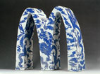
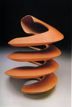
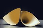
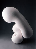
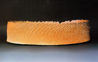
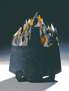
Strong mono-chromatic sculptural forms quietly drew interest, too, proving that one doesn't have to incorporate a lot of bells and whistles into your work to get attention. The free-standing spiral, "Orange Volute" of Mary Roettger (USA) was gorgeous, seeming to create it's own dimension through natural light. "Double Bag" by Rita Ternes (Germany) had quiet strength, also — reflecting simplicity in concept that bespoke of complexity in meaning. There were quite a few studies in black and white, with two of the strongest being works submitted by Kazuko Ikeda (Japan), black, and Tomonari Kari (Japan), white.
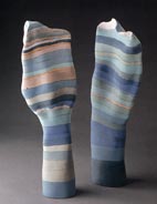
Speaking of color, I must note the entries from the Aussies. Not that I am biased at all, but there is something about the Australian light, and the scale of the sky. Katrin Chambers captures these nuances in her two pieces entitled "Southern Landscape". The subtle transitions and abutting of colored clays really does reflect the landscape through a geologic view and the enormous sky for which I am very sentimental. Katrin's artist statement was also exhibited — a wonderful example of how an image and a brief paragraph can communicate effectively through numerous language filters. Sandy Lockwood, also of Australia, used slab building, stoneware, wood firing and salt glaze to capture the feel of the raw earth in her vessel, "Sands of Time".
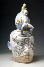
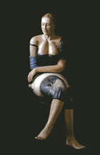
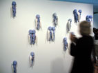
There was a wide array of figurative work, with one of the most prominent pieces being the work of Vilma Villaverde (Argentina) titled "Contemplation". What you might not realize immediately from this image is the artist has hand built the torso and legs, and incorporated them into a piece of industrial ceramic ware — part of a cistern system. The figure is hollow and only connected at the lower part of the arm to the rest of the form, technically, really intriguing. In my last letter I mentioned the work of Hyunsoo Kim (Korea) with those distinctive "Blue Angel Story — The Love". It wasn't until I returned to look at the exhibition this time, did I realize that each angel has a different brooch-like accessory.
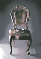
Other large sculptural forms that caught my attention included A chair form by Sunhwa Jin (Korea) entitled "Please take a rest for a while before going on..." It is a cast form, and life size — and very tempting to sit on. Velimir Vukicevic (Serbia) created a form called "Candy" that made me think of medieval Europe at the same time as something completely contemporary such as a basket of feathers, or... candy! As a counterpoint in scale and texture, is the work of Kris Coad (Australia). Her bone china seemed to barely be able to stay on the rod it was displayed on, creating tension with the viewer, and was aptly called "Resting". Rounding out this showcase of talent from down under was Paul Woods, who takes pre-owned ceramic ware and re-fires the composition until they slump. When I first saw this, I completely missed the point — but when I revisited, it pulled me in. What I like about Paul's approach is the sense of fun and irreverence for the serious side (Viva Pablo!!).
Overall, Ceramics as Creative Expression really did live up to it's mantel — the techniques and materials used with ceramics to create expression were extremely ingenious and skillful. All types of clay and firing techniques were represented, along with such added applications as oil and acrylic painting, carving, mosaic work, all sorts of casting including some technically challenging work with fabrics and slip, luster glazes, and mixed media that ranged from stainless steel to human hair to alumina coating.
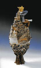
The image that has stayed with me the longest, however, was the work of Shufang Chen (Taiwan), the piece entitled "Utopia". It really seemed to catch the spirit of the moment for me — I am at the top of the ceramic world and, for a brief moment, everything is perfect. Reality will set in once I get back to the Incheon airport and start my next adventure with clay.
Ciao,
Zen
Links
Zen Parry
http://www.ovoo.com
The World Ceramic Biennale
http://www.wocef.com
http://www.worldceramic.or.kr